Remindful
During this time of shelter-in-place, parents of young children have to take on new roles such as being a teacher at home. The goal of this project is to explore ways to support parents during this challenging time.
Role
Human-centered design, visual design, branding.
Time
6+ weeks, 2020
Team
Vienna Li, Paloma Santos
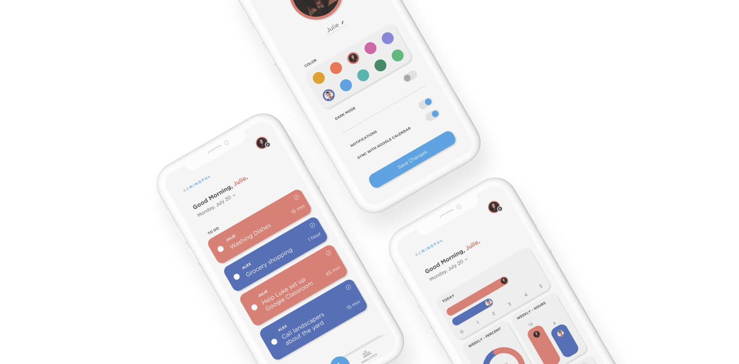
Solution Preview
User Research
Method: In order to practice human-centered design, we set out to seek real anecdotes – we wanted to build a product from real user problems rather than come up with a concept from a preconceived idea.
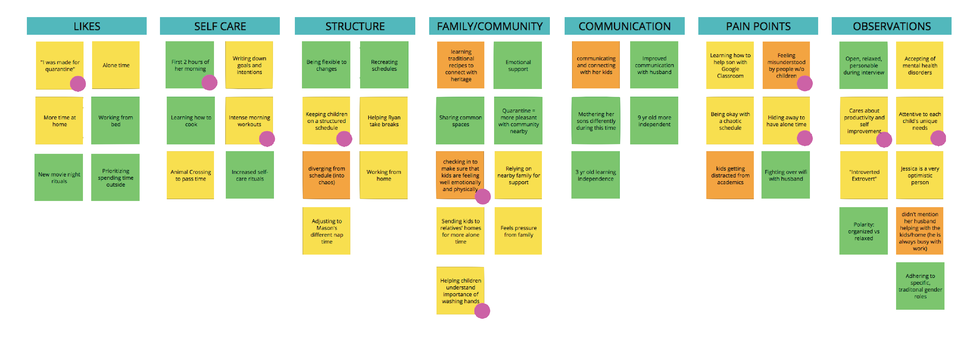
First, we conducted a few interviews with parents of school-aged children. We used the findings to structure our persona, based on a real parent.
Meet our user, Julie.
She is a mother of two school-aged boys. During the pandemic, she has to take care of her sons at home while simultaneously maintain her 9-5 finance job, do household chores, and check in on her relatives.
As a parent, she strives to stay organized, and is especially attentive to her personal goals such as taking breaks, practicing mindfulness, and noting her daily intentions and affirmations. She wasn’t shy to candidly share how she had to learn how to stay calm through chaos when her day does not go as planned.
We then mapped out our ideas, takeaways, inferences, and potential solutions. This exercise helped us visualize our thoughts and develop our solutions. After several rounds of discussion (& starting over), we had our concept!
Refined problem + solution.
How might we improve the division of responsibility between two parents?
Reminders
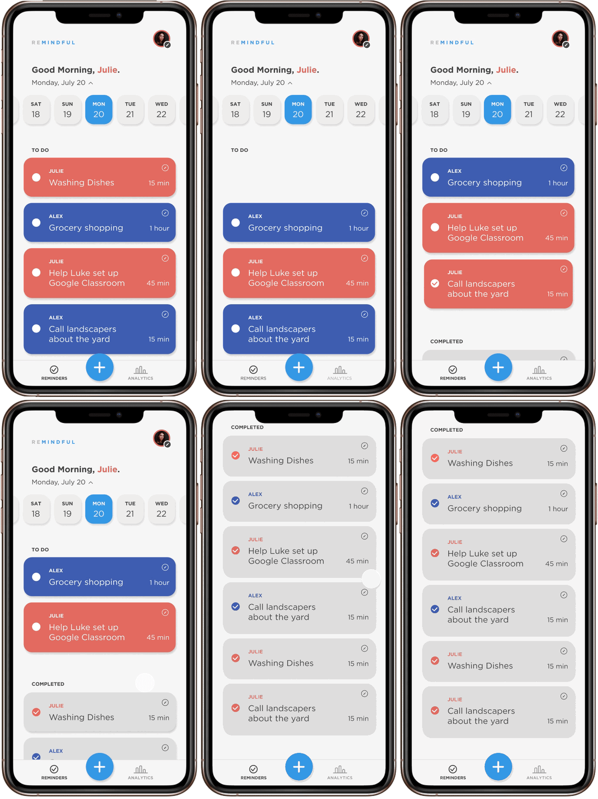
- Displays to-do list and completed list of daily or weekly tasks.
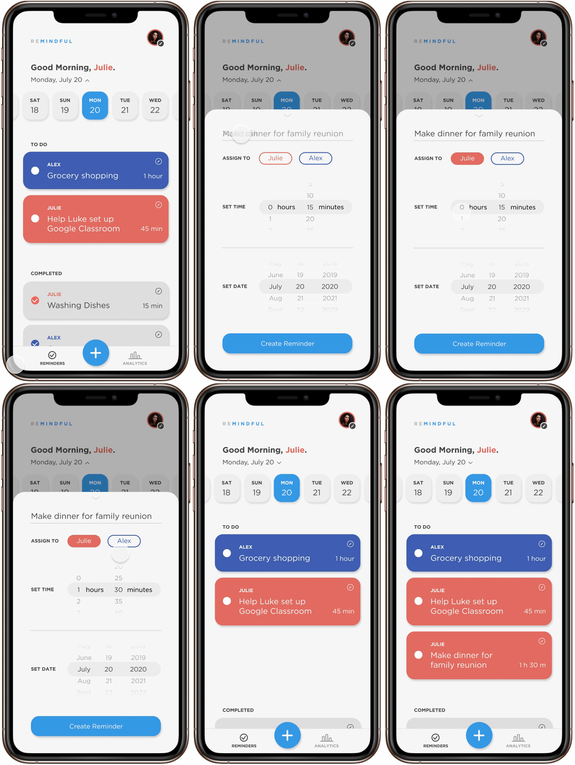
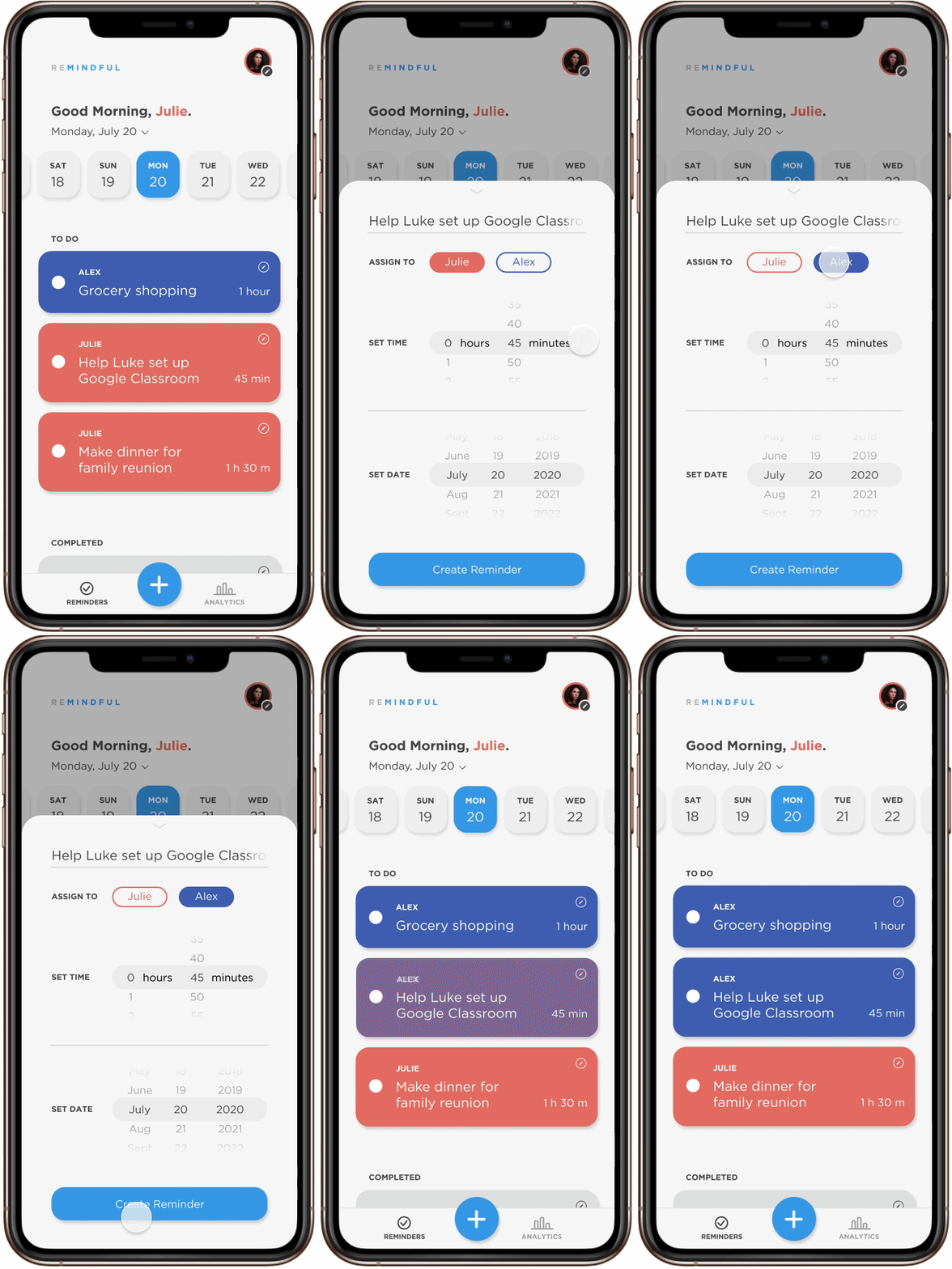
- Each user can add tasks and set who is the task-doer.
- After a task is completed the user marks down the amount of time the task took.
Analytics
- Hours are collected for each user and displayed to show weekly hours and percentages.
- Contains clear graphs visually showing the distribution of work between two parents.
Visual Design
Sketches, iterations, user testing, more iterations, design system, & branding.
Sketches
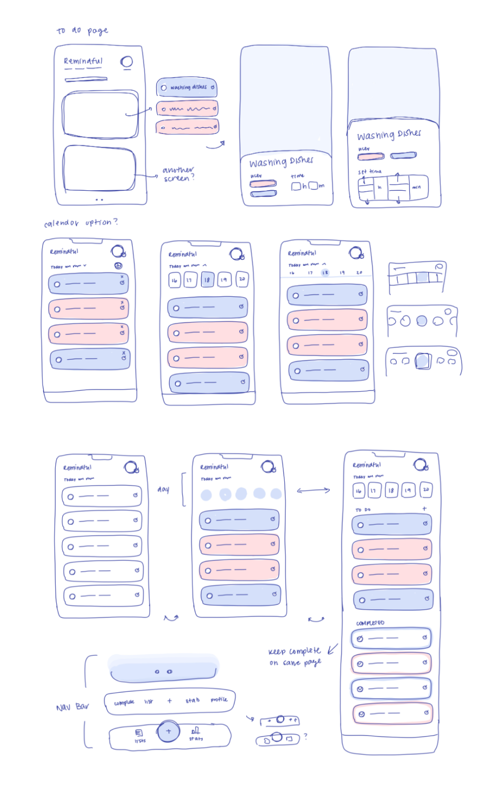
I wanted to consider all design aspects of the app along with the user flow of
01 Creating a task
02 Checking off a task
Reminders Screen
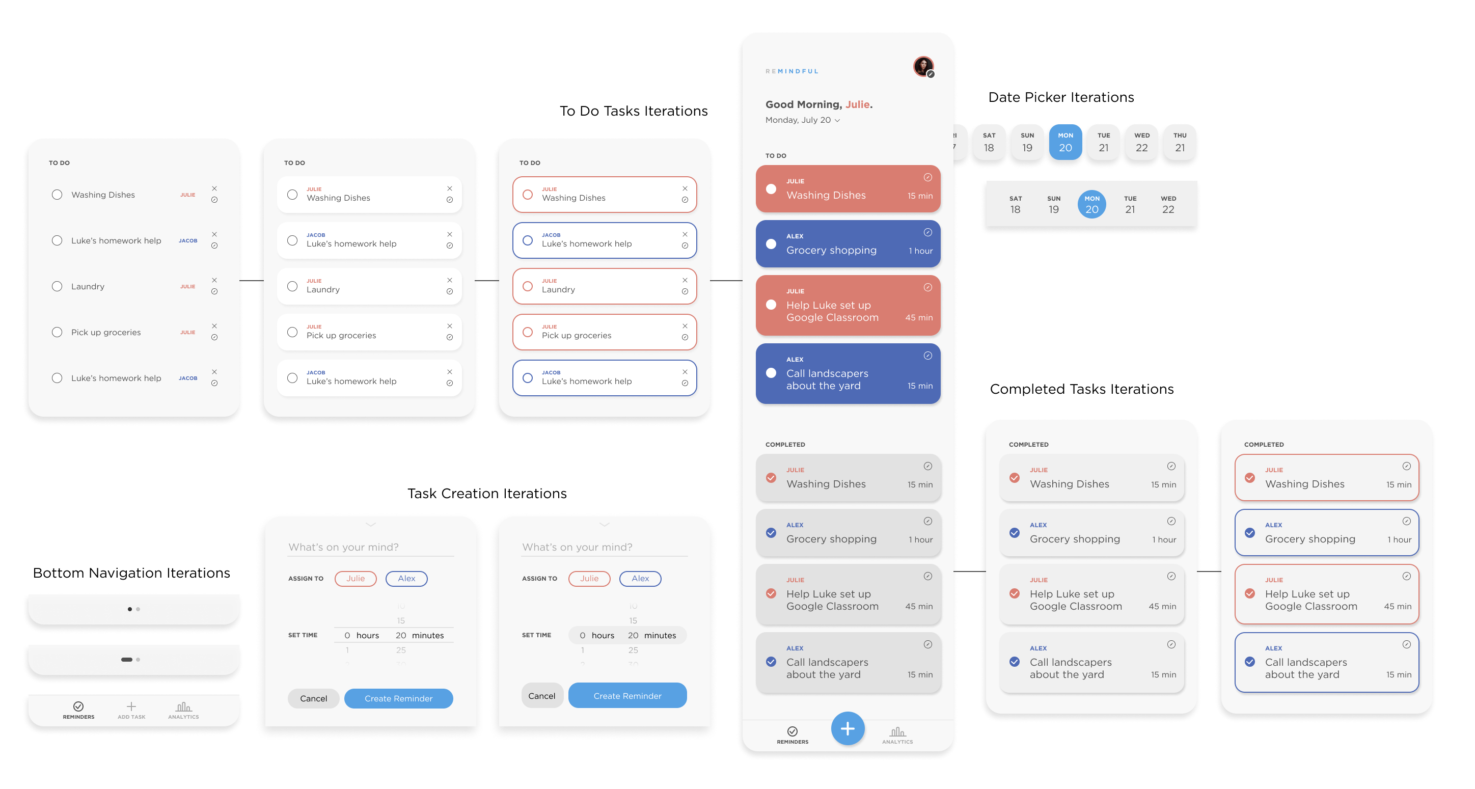
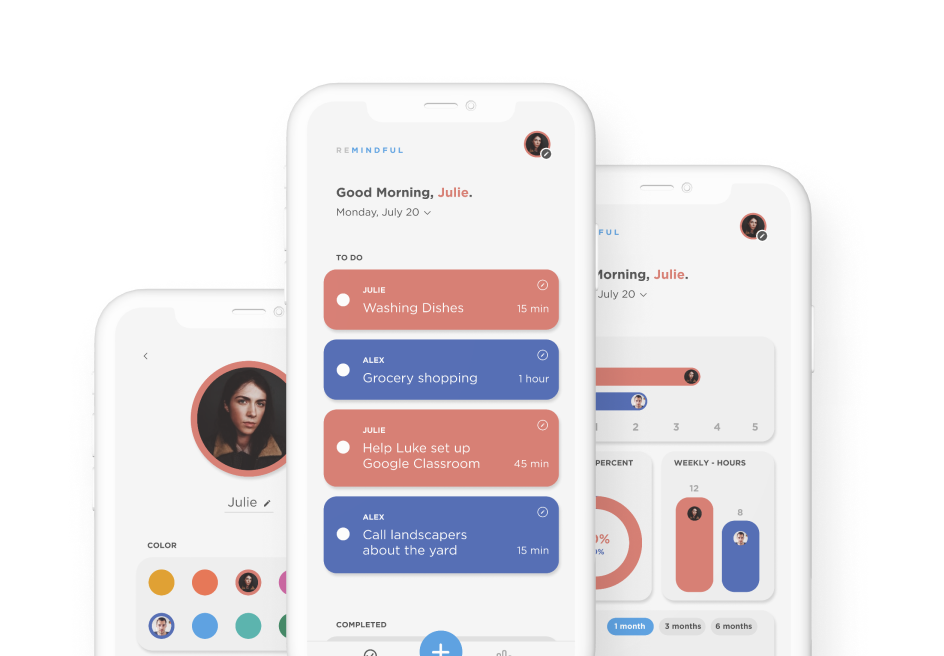
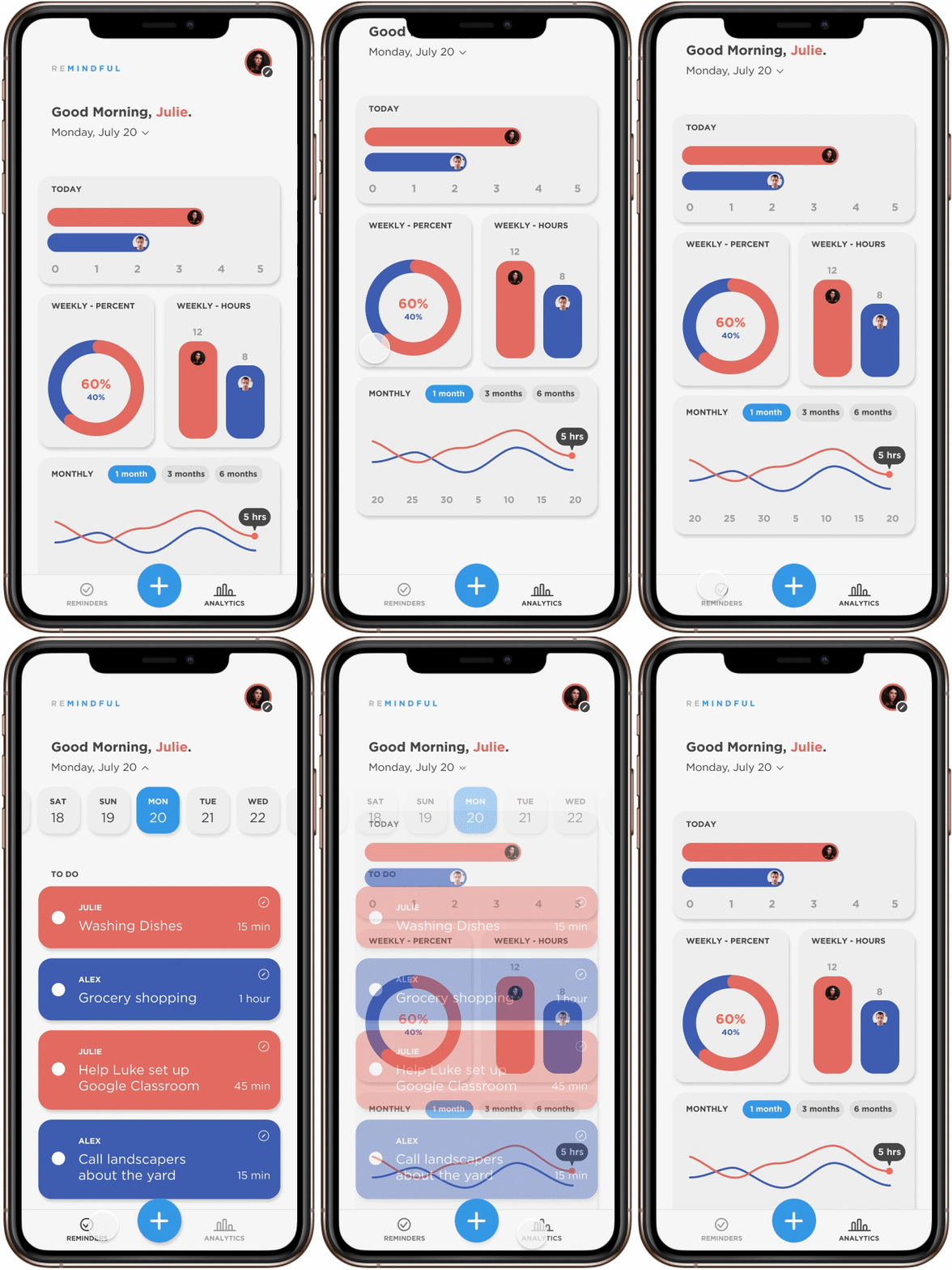
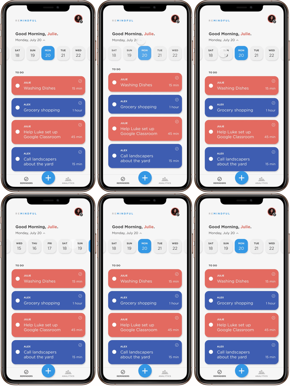
I incorporated custom-colored task cards that match each partner’s profile colors for clarity when checking off tasks. Greyed-out cards indicate that a task is finished – I explored different representations of completion here. I added a large call-to-action button in the navigation bar as creating a task is the main function of the app. I then ideated on the user experience to create a new task. Lastly, a date selector would allow users to jump to different days and allow for future planning!
Analytics Screen
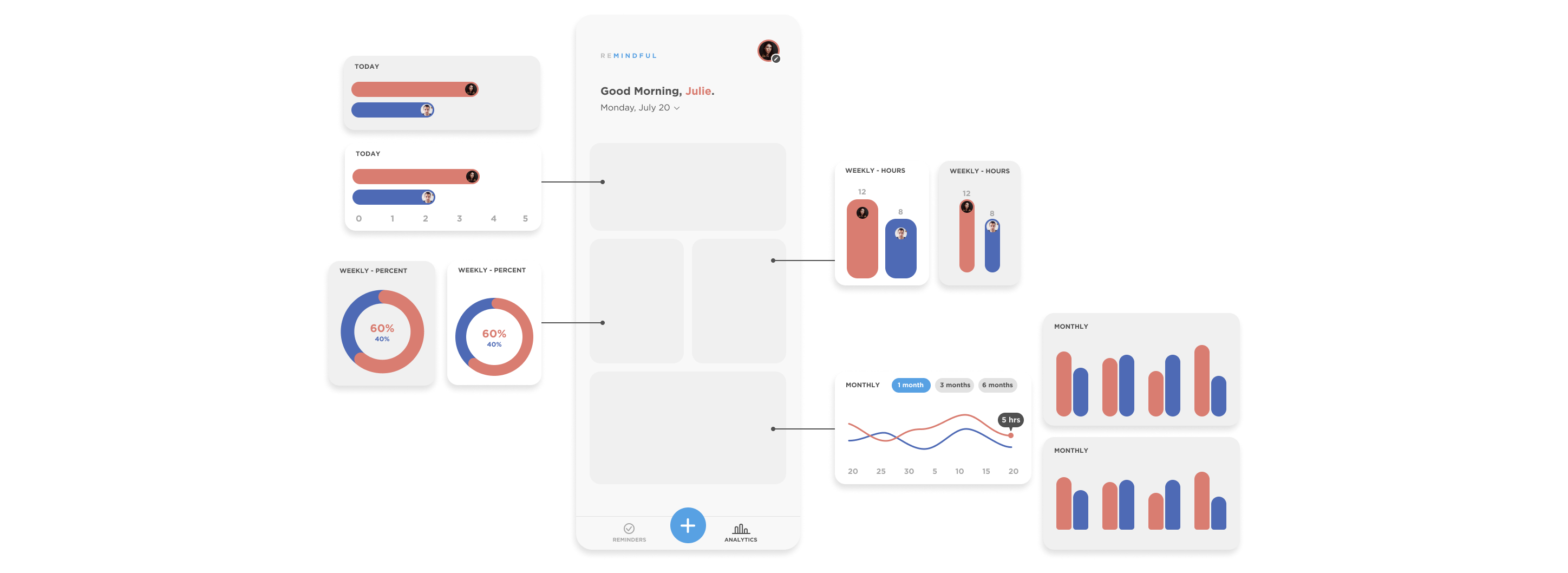
After doing research into data visualization, I opted to include both percentage and hourly units in the weekly graphs, allowing users to understand correlations and long-term trends. Visualizing concrete data may point out any inequalities at home.
Usability testing at the source.
I demoed the prototype to Julie and asked her to give her thoughts. Fortunately, she gave positive feedback and inspired the next wave of feature iterations!
Likes
- Aesthetics, colors
- Analytics keep partners accountable and productive
- Helps user be mindful about time
- Can see herself using this app!
Wants
- Sync calendar apps
- Set task for a future date
- Dark mode
User test updates
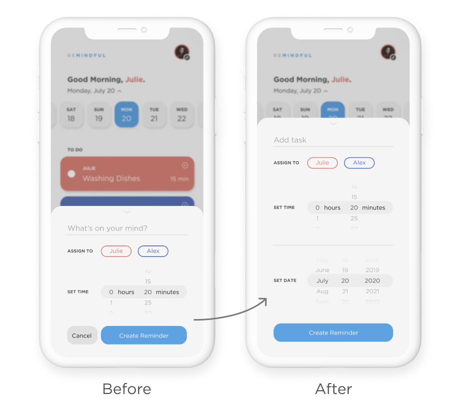
Set a date when creating a task
Allows for future planning, ie “take Luke to the dentist on July 25th.”
User test updates
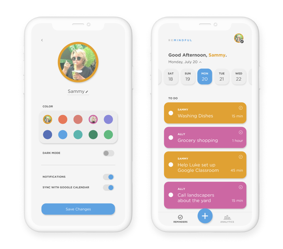
Profile Settings
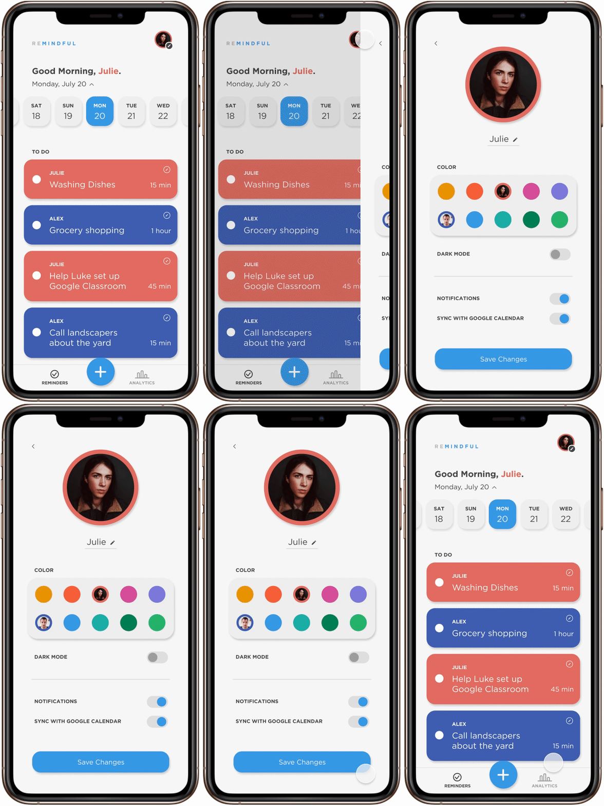
Edit information, custom colors, syncing with google calendar.
User test updates
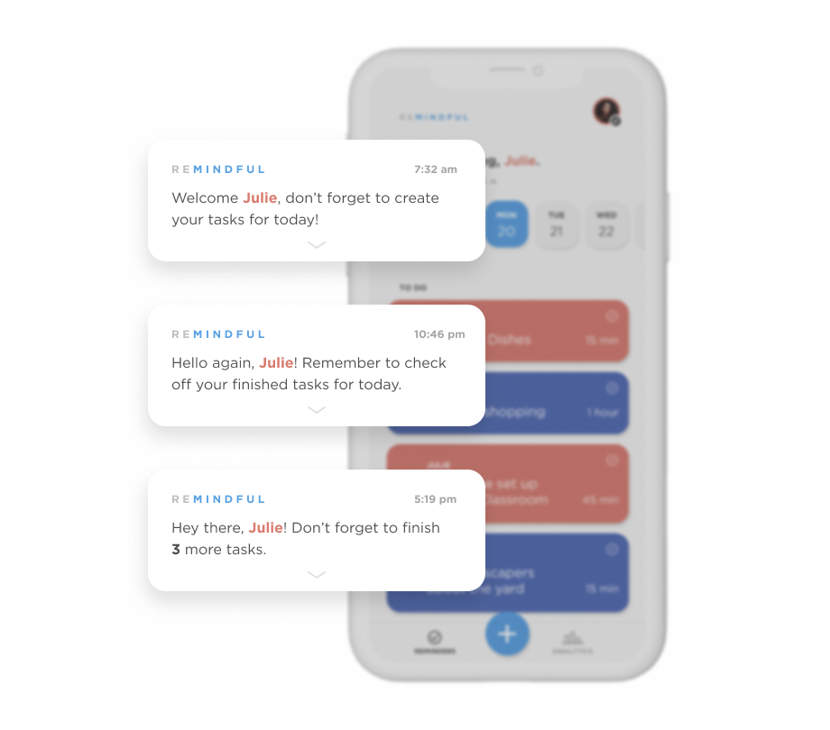
Daily check-in notifications
Keeps users engaged and retains them to stay updated in the app.
User test updates
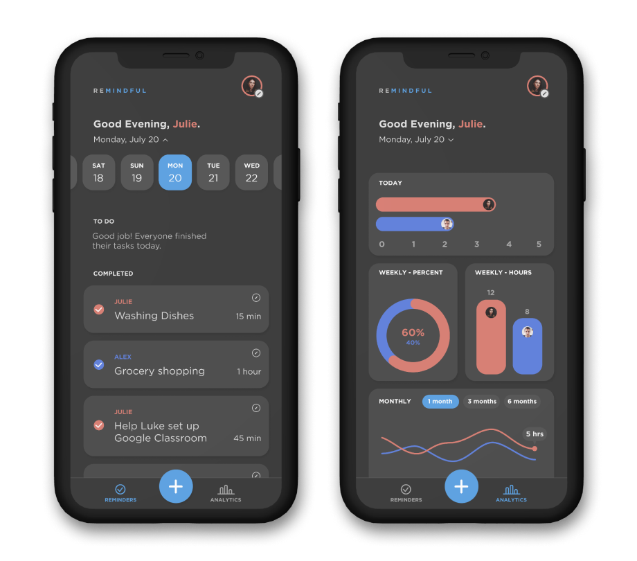
Dark mode
Users can easily plan out the next day’s tasks during the night before without straining their eyes.
Colors & Typography
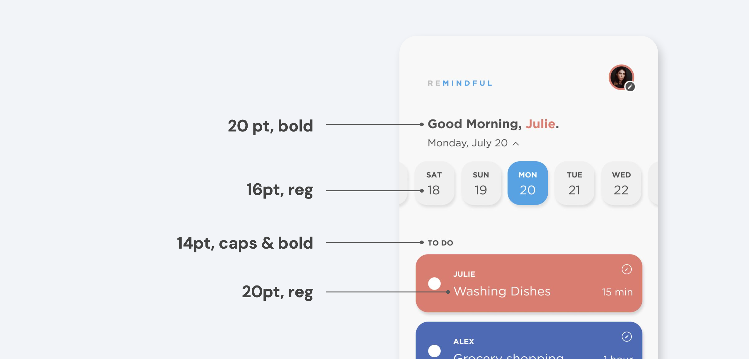
The branding of Remindful is calm and neutral but with pops of color that the user can customize and therefore feel in control of their experience. I chose Gotham, as it’s simple, easygoing, and readable. Also, I made sure all font sizes were reasonably accessible.

Grid
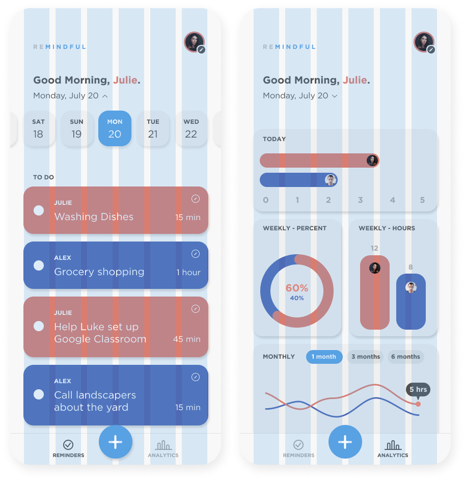
I loosely referenced a 6-column grid, which is a versatile (& my personal favorite) mobile grid as you can easily align one item, two items, or three items in each row. I also made sure all commonly tapped elements were within a reasonable mobile thumb zone range.
Final Design
Remindful
Reminders

Analytics
Creating a task
Editing a task
Select date
Profile
Learnings
Iterate! Iterate! Iterate! I had originally moved to high fidelity too early and learned to slow down… design is a circular process and there is always room for more iterations!
Creating a customer-centric product – I learned to think from the user’s perspective. The main character is Julie, not me!
Designing in a team remotely – I never met my teammates due to COVID-19, however, this experience taught me how to communicate and work effectively, and ended up loving the process!
